

At a Glance
My role Sole Product Designer: UX, UI, and brand direction
Team: Product Owner, 1 engineers, and Stakeholders.
Timeline 1 Month
Status Concept phase completed. Project paused before development due to shifting priorities and budget reallocation.
Tools: Figma, Whimsical, Adobe Illustrator
Process: what actually happened, in the order it happened
1. Concept mapping before visual design
Before touching UI, I mapped the core flows: how a member becomes a seller, how invitations propagate through the closed network, how a transaction flows from listing to payment. This was the first real structure the project had — until that point, the idea lived entirely in conversations.

Merchant's first flow chart.
2. Brand and visual direction.
Earlier than ideal, here's why:
Executive review was scheduled before the feature set was finalized. Rather than fight the timeline, I made a conscious choice: invest in a brand direction distinctive enough that stakeholders would engage with the concept emotionally, which would buy time for the feature work.
I drew on Scandinavian graphic design. Specifically the way it treats each element as a standalone visual unit that coheres into a larger system. It mirrored the product's logic: each seller is their own small storefront, aggregated into a shared marketplace.

Color scheme and first logo iteration.
Merchants: A Project Alias*
The stakeholders responded to the logo concept and adopted it as the project's primary mark. More importantly, the visual work did what it was supposed to do: it made the concept feel real enough to fund.

Login screen, first iteration.
3. Site map: negotiating Phase 1 vs. Phase 2
The hardest conversation of the project was scoping. Stakeholders wanted everything in v1. I pushed back by mapping every proposed feature and categorizing them by: essential for a functional marketplace, dependent on integration with the banking product, and nice-to-have.
This map became the alignment document. It re-framed the conversation from "what do we want?" to "what is the smallest coherent thing we can launch?" which is a question stakeholders were more willing to answer.
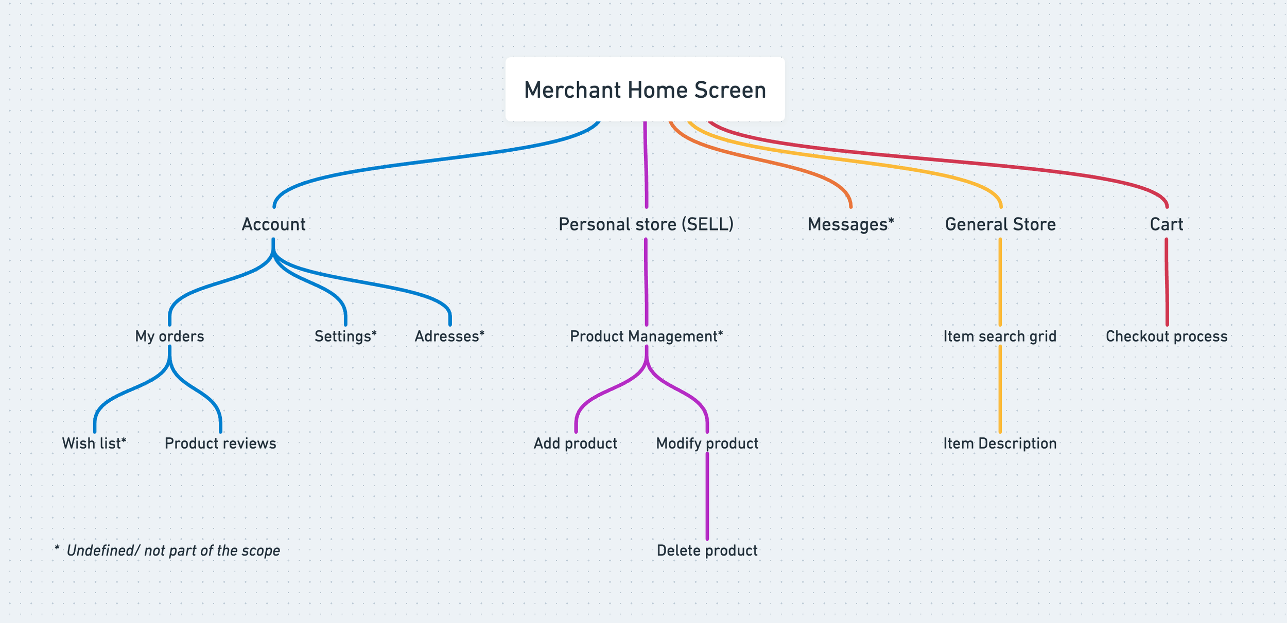
Censored map site to address some features of the Merchant’s App
4. Mid-fidelity screens
I deliberately stopped at mid-fidelity rather than pushing to polished UI. Two reasons:
The feature set was still in motion; high-fidelity work would have been thrown away
Mid-fidelity forces stakeholders to engage with structure and interaction, not aesthetics
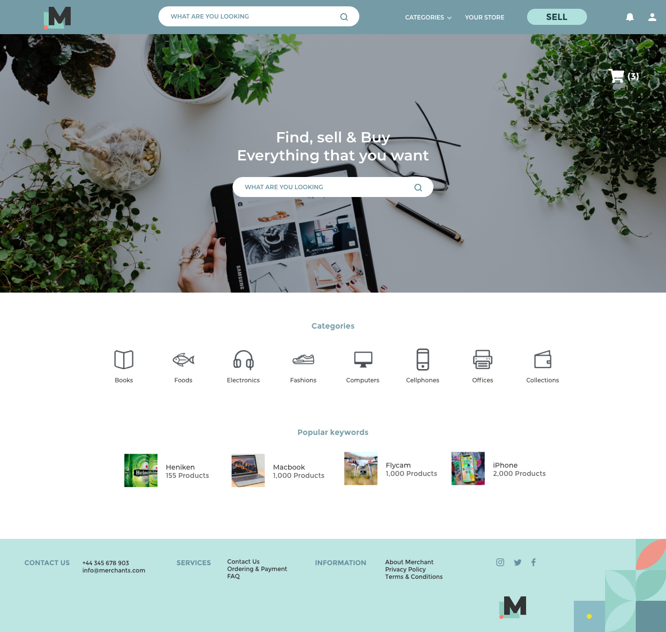
First Iteration home Screen

Search and select and view product.

Step to start selling a product.
Challenges and trade-offs
No user research in Phase 1. This was the constraint I was most uncomfortable with. I mitigated it by basing decisions on observable behavior (the existing chat-based trading) and by explicitly documenting every assumption I was making, so that Phase 2 would know where to validate first.
Designing a second product for users already inside a different one. Members would move between the banking platform and the marketplace in the same session. I spent significant time on the seams, making the marketplace feel like a natural extension rather than a separate app. This is the kind of work that doesn't show up in a screen-by-screen portfolio but shapes everything.
A moving feature set. The scope changed multiple times during the engagement. Rather than rebuilding from scratch each time, I built the site map and flow diagrams as living documents, which let us absorb changes without restarting.
———————————————————————————-
What happened, and what I'd do differently
The project was paused in 2020 when leadership priorities shifted and the budget was reallocated. The work wasn't built, but the brand direction and the scoping framework continued to be referenced internally for the marketplace idea.
If I were starting this project today, I would:
Treat the executive review as a design problem in itself, with its own success criteria. I handled it intuitively, but I'd now build a pitch narrative with as much rigor as the product itself.
Separate brand exploration from product visual design more cleanly. Collapsing them under time pressure muddied both; with more space I'd keep them on distinct tracks and let each inform the other.
The project didn't ship, and I'm OK with that being part of the story. What I took from it was a durable understanding of how design operates when the ideal process isn't available, which turns out to be most of the time, in most companies.